We all agree that webinars are an effective strategy to get more leads and grow your revenue.
But creating a webinar and making it successful can be a challenge.
It takes time and experimentation to create a successful webinar.
Maybe you have the perfect webinar, and you’re sending lots of traffic to your webinar landing pages, but you can’t get enough people to sign up.
This immediately decreases the effectiveness of your webinar.
And this alone can make the difference between having a mediocre webinar and having a wildly successful one that generates a strong ROI.
In this post, we’re going to solve the webinar landing pages problem.
You’re going to watch me analyze ten different webinar landing pages and critique each of them so you can know what they did right and what they could improve.
But first…
Best Practices for High-Converting Webinar Landing Pages
It’s important to know some of the best practices to keep in mind when creating a high converting landing page for your webinar.
The principles outlined below are easy to implement and will make your webinar landing page exponentially more effective.
Grab Attention With Your Headline
Your headline is what captures the attention of the people who visit your page.
In fact, as much as 70% of the effectiveness of your landing page comes down to the headline, particularly the benefit it describes and the curiosity that it instills in the reader.
As David Ogilvy says:
“On average, five times as many people read the headline as they read the body copy. When you’ve written your headline, you’ve spent eighty cents out of your dollar.”
So spend some good time working on your headline. You should write multiple variations and not just go with the first one that comes in mind.
But how can you create an effective headline?
Here are four building blocks you can use to create an effective headline:
- Pain: People are more eager to avoid pain than to gain something. So what’s the pain that they want to avoid?
- Benefits: What’s the main benefit they’ll get from watching your presentation? Be as specific as possible.
- Numbers: Numbers are a great way to show the specificity of the benefit. It lets people know exactly what they’re getting and instills more curiosity.
- Timelines: How long will it take to achieve the benefit you’re describing?
I created a video that goes in-depth on these four building blocks with examples…
Click here to watch my headline video.
You can also try this headline template to get you started:
[Number of Steps] to do [Benefit] without [Pain] in [Amount of Time]
A good example would be:
3 Steps to Double Your Podcast Downloads in the Next 30 Days without Paying for Ads.
The order of the building blocks doesn’t have to be exact, but make sure that your webinar content backs up the claims you’re mentioning in the headline.
Above-the-Fold Call To Action for Your Webinar Landing Pages
This one is a must. Have a clear call to action button in a contrasting color above the fold of your webinar landing page.
“Above the fold” comes from the newspaper days where a story was placed above the fold of the newspaper.
On the web, this means the space at the top of your page that’s visible without needing to scroll down.
And people don’t always scroll down.
So make it very clear what the benefit of attending is with your headline, and right below, in the center of your page, have a “Register Here” button.
According to this research released by Google, they found out that ads above the fold have a 73% viewability rate, whereas ads below the fold have a 44% viewability rate. That’s an 84% difference. The same difference applies to your webinar landing page call to action buttons.
So give them clear instructions to sign up. If they’re not convinced, they’ll read the rest of the page and then decide to opt in or not, but most of the time you don’t have that much time.
Social Proof
Social proof is a great way to persuade people to take the action you want, whether that’s signing up for the webinar or purchasing your products or services.
People don’t want to feel alone. A great way to use social proof on the webinar landing page is to show testimonials or third-party validation. This is usually placed below the fold for those who scroll down.
You can also include logos of places you’ve been featured, such as magazines, talk shows, etc. This is a great way to boost your credibility.
Messaging on Your Webinar Landing Pages Matches The Ads/Traffic
Yes, this post is about the webinar landing page itself, but you need to take into consideration the messaging that the visitor receives before they land on the page.
If the messaging is different, it’s easier for them to close the page and move on than to try to understand the new messaging on the page. The color scheme should be similar as well.
That’s why you should focus on sending quality traffic and make sure that the messaging is consistent pre-landing page, on the landing page of your webinar, and after they sign up and attend the webinar. Congruence is key.
Bullet Points that Show The Benefits (And Evoke Curiosity)
All good marketing copy uses bullet points. Your webinar landing page should be no different.
Bullet points are a great way to break up a big paragraph, grab the attention of people visiting the page, and most importantly, highlight the benefits in small chunks that entice them to take action.
The most important thing is to make them benefit-driven. Encouraging some curiosity to make them want to attend the webinar is nice as well, but don’t overdo it.
If you find it hard to articulate the benefits, use the phrase “so that” after your feature to turn the sentence into a benefit.
Using emotions and painting a picture with your words is a great way to move them closer to taking the action.
Ask For Enough Fields (Not More)
One of the biggest mistakes people make is adding a lot of unnecessary fields for the visitor to enter before they’re signed up.
The truth is most of these fields are nearly useless for your business anyway.
If you can stick with just an email and name, go with that.
Also, experiment with asking for their phone number and make it mandatory to enter it. For most B2B businesses they should actually collect the phone number.
Sending SMS messages gets more people to actually show up on the webinar. It’s also great to follow up with the prospect and close the sale.
One Call to Action (CTA) on Your Webinar Landing Pages – Remove Distractions (Even The Navigation Bar)
A simple mistake that you could make is to ask your audience to choose between different actions (or even just give them the opportunity to do so.)
This means that you’re better off removing your navigation bar, which leads to the blog page, home page, etc..
If they don’t sign up, you can then retarget them with other ads and warm them up till they want to sign up.
But when they land on the landing page of your webinar, give them one option, to sign up or leave.
Directional Cues – Direct Your Visitor’s Attention to Sign Up
Directional cues are visual elements that guide visitors to your call to action to register.
It could be in the form of imagery, like a photo of you looking at the call to action button, as you will see in the examples below, or arrows or lines that point in the direction to the call to action button.
You may doubt that these small changes matter, but as Oli Gardner, the founder of Unbounce, says, “Arrows are about as subtle as a punch in the face. That’s why they work.”
Fast Loading Speed
This is a must nowadays.
It doesn’t matter if you have the perfect design with the perfect copy if it takes forever to load the page. Your audience’s attention span is very short.
For every second your visitors are waiting for the page to load, you’re losing conversions and profits.
To give you a perspective on how much speed affects conversion, conversions drop by 12% for every second of load time according to Google and by 7% for every second according to Akamai.
You can’t afford to lose these conversions, right? So focus on increasing the speed of the page.
Mobile Responsiveness
If your webinar landing pages are not mobile-friendly, then you’re leaving a lot of money on the table.
According to Statista, mobile devices (excluding tablets) generate 51.92% of global traffic. If your site is not optimized for these people, then you’re losing half of your potential audience.
According to Adobe, making your site mobile-optimized triples your chances of increasing mobile conversion rates to at least 5%. This research was done way back in 2013, and it’s actually much higher now.
Less Is More
It’s tempting to keep adding copy to convince people to sign up for the webinar, but most of the time, less is more.
Writing more copy can do you more harm than good in most cases.
Having a clean and simple user interface with a clear CTA is the most important thing. Focus on adding just enough to get people to sign up.
Test and Follow Numbers
Your intuition is great when you’re just starting, but you can’t trust it 100%. You need to test and have clear data on what works and what doesn’t.
What works in your industry may be the opposite of many of the above best practices. So always keep testing.
10 Webinar Landing Pages Examples (And What They Did Well)
Seeing examples of other webinar landing pages, what they did right, and what they could improve on is the best way to kickstart your creativity and help you get your next webinar landing pages done and ready.
It’s also helpful if the current landing page of your webinar doesn’t convert as well as you want it to.
Most of the examples below are solid. Make sure to check the points below each one to know what made it effective and what could be improved/tested.
So without further ado, here are 10 webinar landing pages to model after.
#1. Danielle Leslie’s Course From Scratch Masterclass Webinar Landing Page.

After she launched her own online course in 2012, Danielle Leslie started helping people launch their own courses.
She is a master when it comes to using webinars to generate course sales. She generated over $10M with one webinar funnel (you can learn how she did it during my Webinar Master Summit.)
There’s a lot to learn from her when it comes to creating webinar landing pages that convert.
What She Did Well:
- Not much copy, just enough to entice you to sign up
- A clear call to action above the fold with a contrasting color
- She used her image and looked directly towards the call to action to move your attention there
- No other action can be done on this page, either you sign up or leave the page
- The landing page is mobile responsive with a clean layout.
What She Could Test:
- Added social proof. Yes, she mentioned briefly how she had helped people, but she could add some testimonials from those people or icons of blogs and magazines she’s been featured on
- The headline could be more specific with a timeline and add a subheading with some pain points addressed. For example, “How to Turn Your Passion, Skills, and Expertise Into an Online Course in Under 8 Weeks…Even if You’re Allergic to Technology”
- She could test adding bullet points to describe the desired outcome even more. How will they get the course done and so on.
#2. Ryan Barba’s MBA’s Admission Webinar Landing Page.
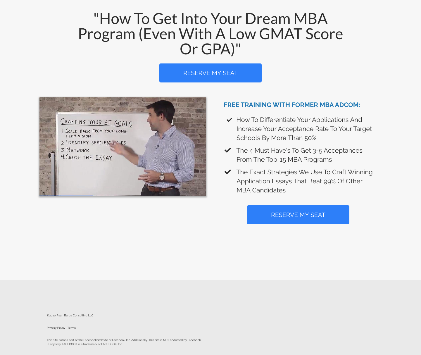
Ryan Barba is an MBA Admissions Consultant who helps people get into the MBA program of their dreams.
What He Did Well:
- The page is super clean. The focus is on the direct call to action button which is a sharp contrasting blue.
- A benefit-driven headline that handles objections right away “Even if You Have A Low GMAT Score Or GPA”
- Clear bullet points that show the benefits to the attendee while also invoking curiosity. What are those 4 Must-Haves? People will be curious and want to attend
- The site is mobile responsive and loads fast.
What Can Be Tested:
- The image should be looking at you to give you a sense of Ryan and his inviting personality
- Adding social proof: icons of places he’s been featured, stats on the number of students he has helped, or up to three text/image testimonials talking about how Ryan helped them.
#3. Casey Zeman’s 6 Steps to a High Converting Sales Webinar.
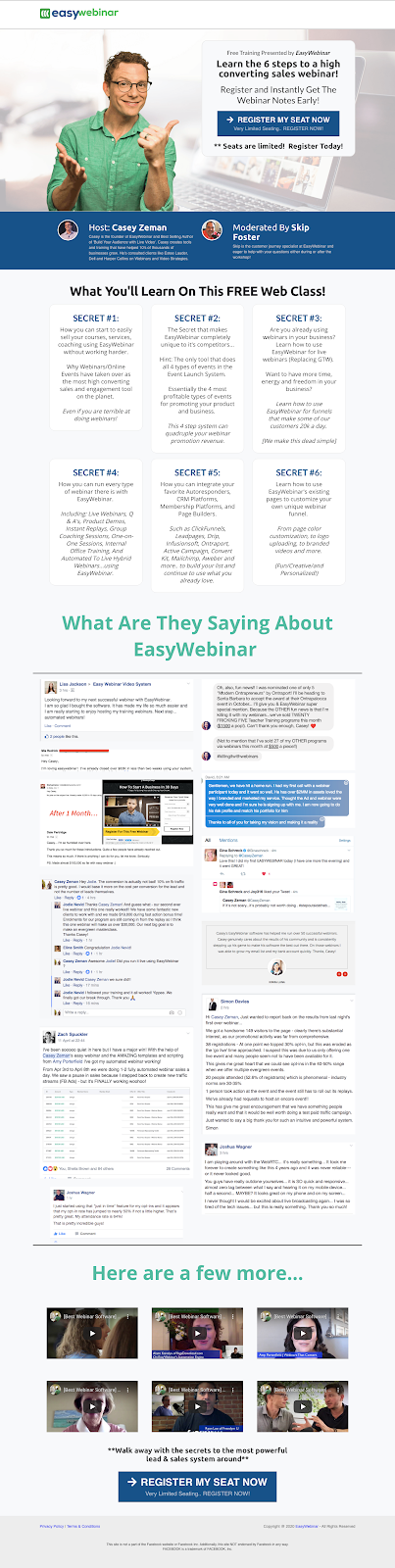
Casey is the Founder of EasyWebinar, a live and automated webinar platform which, in 2019, hosted more than 1.4 million webinars. So he gets to see what’s working and what’s not working with webinars.
BTW, don’t forget to check out my interview with Casey during my Webinar Mastery Summit.
This is one of the main webinars that he’s using to get people to sign up for EasyWebinar.
What He Did Well:
- Casey’s image is looking right at you, smiling with a thumb pointing towards the call to action
- Above-the-fold call to action with minimal copy above the fold
- If you’re not convinced and you scroll down, the “what you’ll learn on this free web class” section will show you why you need to sign up with an effective bullet-point-like structure.
What could be improved?
- The headline could be improved by sharing a pain the audience doesn’t want to have, like feeling overwhelmed with the technology
- The 6 secrets area is very wordy. I would recommend consolidating each of them into one big, curiosity provoking idea.
#4. Michael Leonard’s Land Freelance Writing Clients Webinar Landing Page.
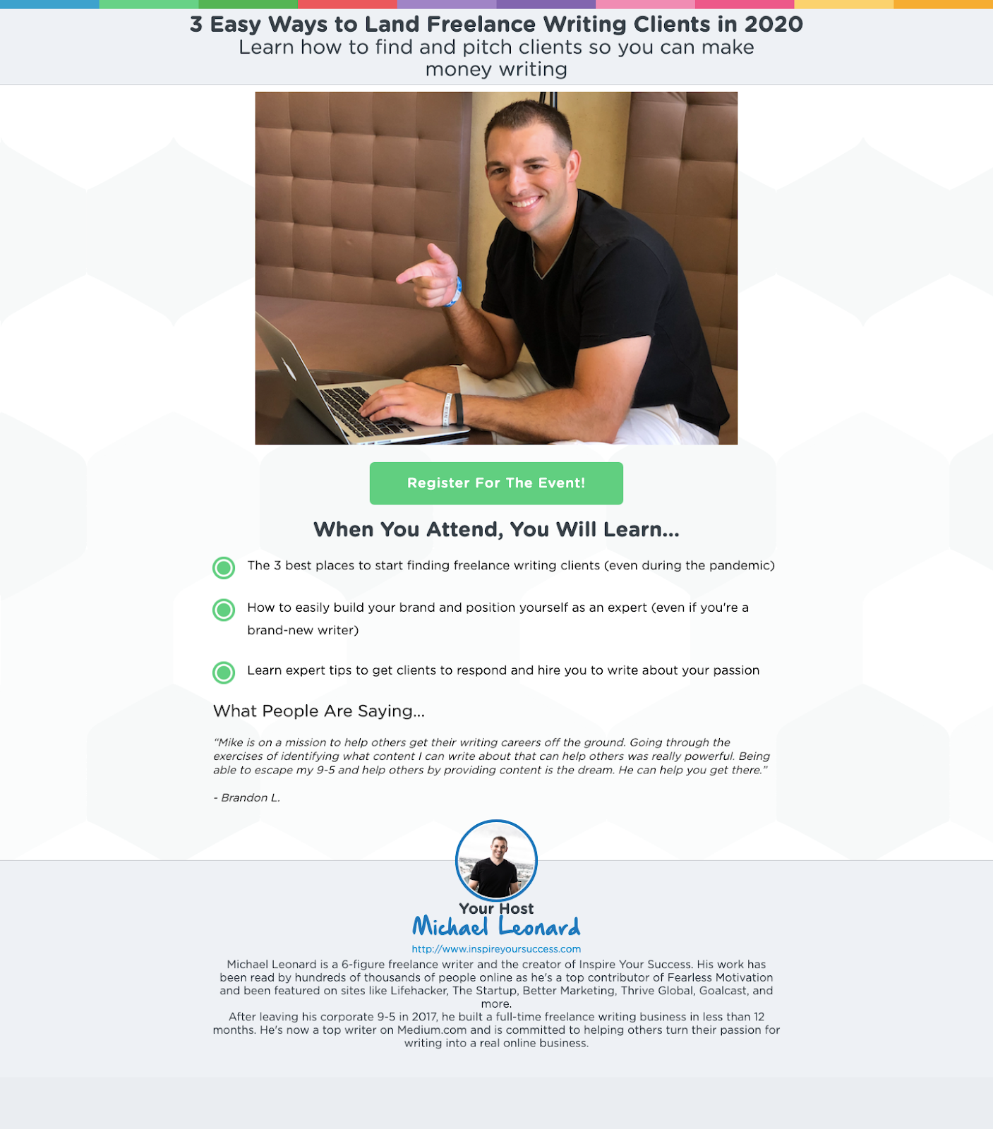
Michael Leonard is writer and the creator of Inspire Your Success.
What He Did Well:
- A clear headline and subheadline with clear benefits
- Call to action button is above the fold and is a contrasting color
- Michael’s image is smiling with a finger pointing slightly down towards the call to action
- Clear benefit-driven bullet points (except maybe the last one)
- The page is clean without a lot of clutter and no other CTAs.
What Could Be Improved:
- The image takes a big portion of the area above the fold. Put it on the right and use his finger as a directional cue, or inverse the image to put it on the left
- Add the call to action again at the bottom
- Add social proof of places he’s written for.
#5. Kim Constable’s Sculpted Vegan Webinar.
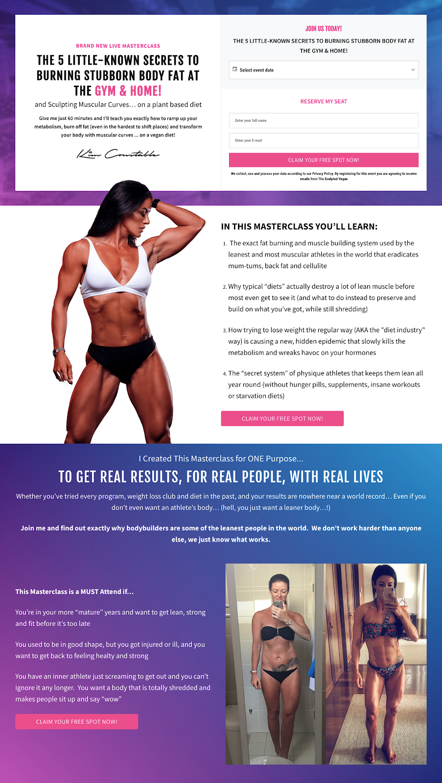
Kim Constable helps people, mostly women, be able to burn fat and build muscle using a vegan diet.
What She Did Well:
- Her unique selling proposition is great and apparent on the whole page. People are tired of the “lose fat and build muscle” training programs, but using her USP, she gives people a reason to check this out
- The copy is great with a benefit-driven headline that clears objections
- A clear call to action button above the fold with a contrasting color
- The bullet-points are clear and show her USP even more
- The copy at the end for who should attend with the image on the right as social proof is great. If you’re on the fence, this image and copy motivates you to sign up.
What Can Be Improved:
- There are a lot of different size fonts and there’s a lot of copy above the fold
- The page is very busy and could do with less text. Less is more.
#6. Pat Flynn’s Podcasting Masterclass.
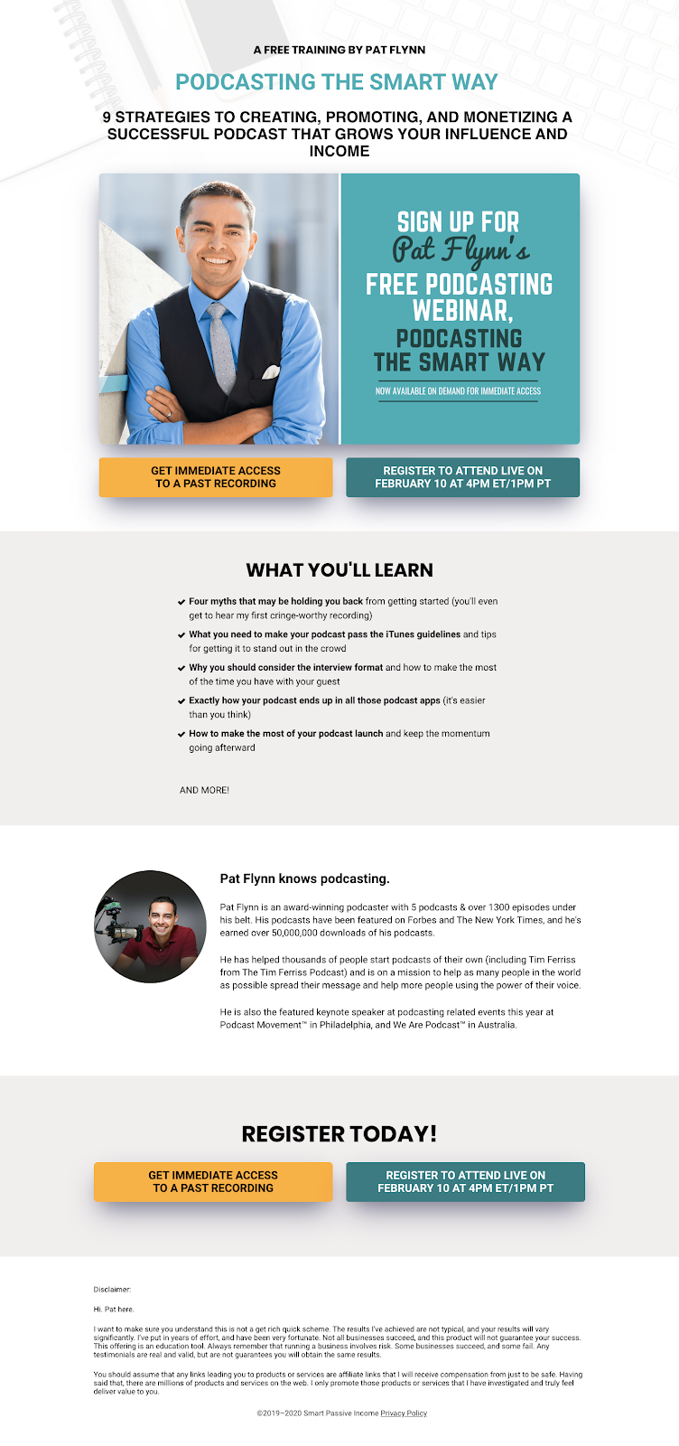
Pat Flynn is known for his podcast Smart Passive Income and for creating a course to teach people how to start podcasting. One of the ways he gets people to register for the course is through his webinar.
This is the webinar landing page he used to get people to register for his latest webinar in February.
What He Did Well:
- The headline is clear with some curiosity. People want to know what those nine strategies are
- Nice, professional image of Pat with a smile
- Bullet points deepen the curiosity of what he’s going to share
- The about section shows his authority and why you should listen to Pat
What Could Be Improved:
- The text image to the right of Pat’s picture distracts the page visitor and should be removed
- Add some social proof factors that are easily scannable versus reading them in his bio. For example, “Host of the Smart Passive Income Podcast with More Than 50,000,000 downloads and counting.” Remember, people don’t read webpages at first, they scan them
- The call to action buttons should be centered, with the primary action he wants people to take in a highly contrasting color and the secondary action in a less contrasting color.
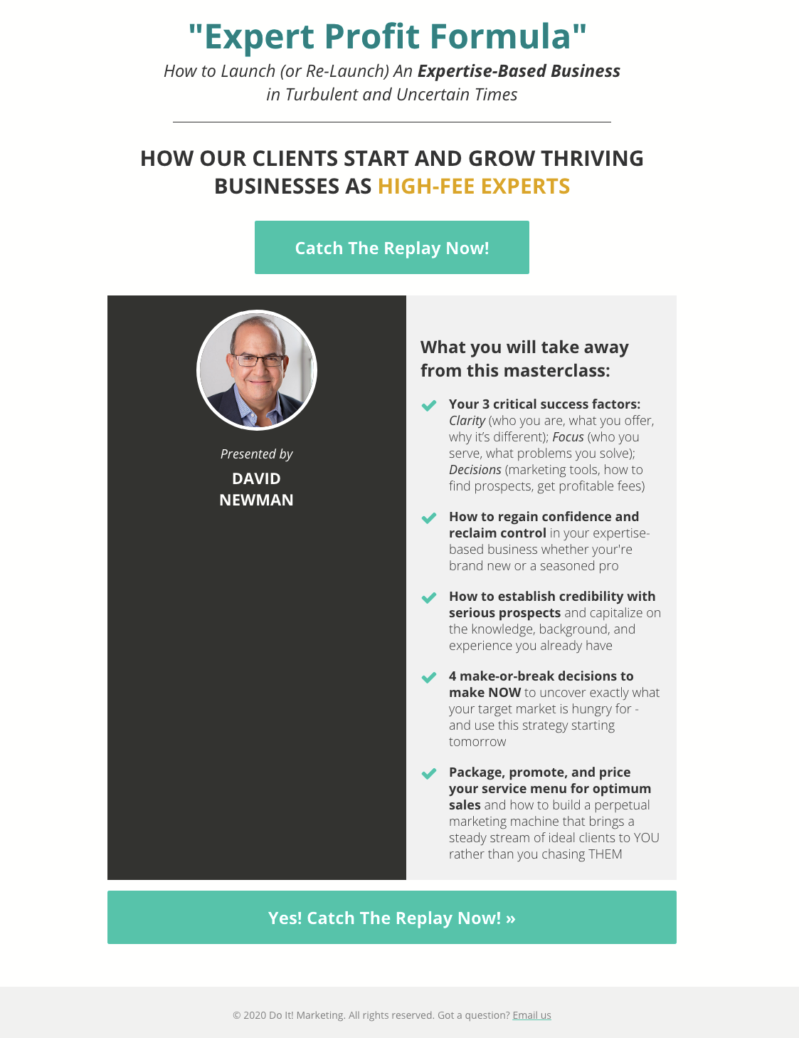
#7. David Newman’s Expert Profit Formula Webinar Landing Page.
David Newman helps thought-leading entrepreneurs to market their messages and monetize their expertise. The webinar will show you how to start and grow your business.
What He Did Well:
- The subheadline speaks to the current business environment, thus making it more relevant
- Clear benefit-driven bullet points that show the benefits of the webinar
- Above the fold call to action with contrasting color
- Mobile-optimized
What could be improved
- There is a lot of wasted space to the left of the bullet points
- Add some social proof factors: badges, authority shots, testimonials.
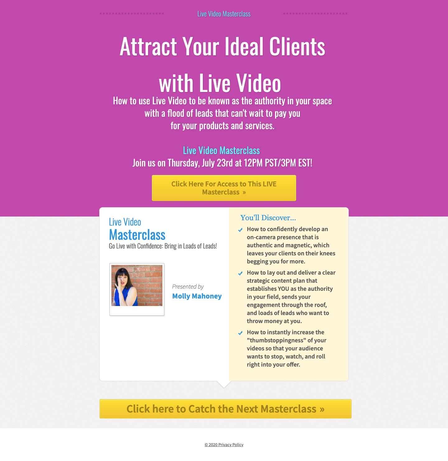
#8. Molly Mahonny’s Live Video Masterclass.
Molly helps experts attract clients using live videos. You can learn more about how she does this during the Webinar Mastery Summit.
What She Did Well:
- Her headline describes a benefit, “Attract Your Ideal Clients,” and a unique mechanism, “With Live Video”
- The subheadline reinforces the benefits of using live video
- The use of classic “How to” copy in the bullets helps to clarify what you will learn while building some curiosity
- Mobile responsive
What Could Be Improved:
- Add some social proof factors: badges, authority shots, testimonials
- Her image is too small and doesn’t lead people to sign up
- Too many colors and font sizes confuse the eye.
#9. Navid Moazzez’s Virtual Summit Masterclass.
Navid Moazzez is an expert on using virtual summits to build your business.
His program, Virtual Summit Mastery, helps you launch your own profitable virtual summit.
Here’s a screenshot of one of his recent webinar landing pages:
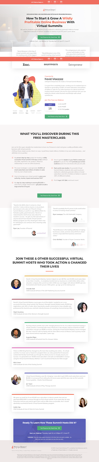
What He Did Well:
- The design is really top-notch, which is something that I like in his brand
- Good use of badges and quotes from well-known publications to build his authority
- Call to action is clear with a contrasting color, and it’s shown multiple times in the center of the page
- The bullet points evoke curiosity.
What Could Be Tested:
- Make the headline more specific instead of just “Build a Wildly Profitable Online Business,” it could say something like “Explode Your Email List and Become an Industry Authority in Under 90 Days with Virtual Summits”
- Use more bullets instead of block text under the “What You’ll Discover” section.
#10. LeadersPress’s Outsource Your Book webinar.
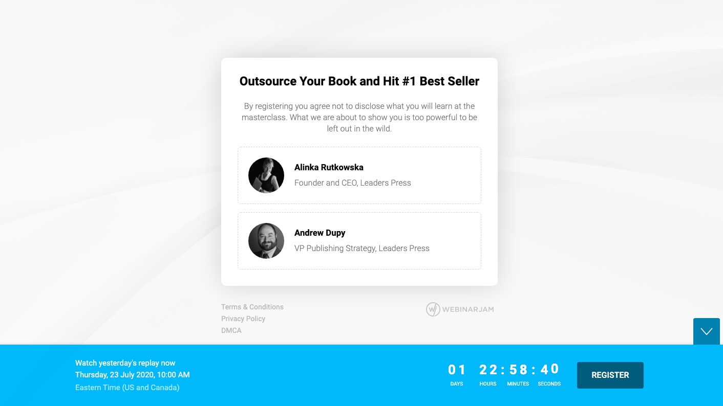
LeadersPress, founded by Alinka Rutkowska, helps people with book ideas to write their book and get it to bestseller status.
And as you can see the page is super simple, and it defies many of the known rules.
But what I know is that It has generated a lot of revenue for them. You can learn more about how Alinka uses webinars to sell high-ticket offers during the Webinar Mastery Summit.
What they did great:
- The clear headline talks about making it easy to create your book by outsourcing it. The #1 idea of having a best seller appeals to the increased status the author will obtain
- Everything is minimal and above the fold. The true meaning of less is more.
What they could improve:
- Use more social proof factors: badges, stats (# of pages written or authors published), and/or testimonials.
Want Help with Your Next Webinar?
Webinars are a powerful tool to grow your business.
Your webinar landing pages are what people see before attending your webinar.
Get it wrong and everything you do after that will be less effective.
I hope you enjoyed this breakdown of how to make a high-converting webinar landing page.
If you would like help using webinars and want my team to create or improve your webinar, then check out this page and book a call.